The choice of colors in scientific figures and graphs is often overlooked, even though it can have a significant impact on the understanding and interpretation of results. Three recent studies highlight the importance of using scientifically designed color palettes to visualize data accurately and in a universally accessible way.
Unsuitable palettes distort data
A study published in Nature Communications in 2020 reveals that some commonly used color maps, such as the rainbow, can cause visual distortion of data by up to 7%. What’s more, these palettes often render information illegible for color-blind people, thus excluding a significant proportion of the scientific public.
A widespread problem in chemistry
In the chemical sector, the situation seems particularly worrying. A study published in Angewandte Chemie International Edition in 2022 shows that more than two-thirds of articles in leading chemistry journals contain figures whose information is not accessible to color-blind people. The authors highlight the problems associated with the use of common color combinations: “The main problem with this color combination, and with many others, is the lack of visual difference between at least two of these colors for people with reduced color perception”.
Towards scientifically designed pallets
In view of these findings, the scientific community is called upon to adopt visually uniform color palettes that are accessible to all. A study published in Current Protocols in 2024 provides guidelines and practical resources for selecting and using appropriate color palettes in scientific figures. These palettes, designed on a scientific basis, have several advantages:
- They provide a faithful representation of the data without introducing visual bias.
- They are accessible to color-blind people.
- They make the figures easier to read and understand for all readers.
Recommendations for research teams
To improve the quality and accessibility of their visualizations, research teams are encouraged to :
- Check that their figures are accessible to color-blind people.
- Avoid problematic color combinations, such as red-green-blue.
- Give preference to pallets that have already been validated.
However, as Crameri et al. (2024) point out, adopting these best practices remains a challenge: “Ignorance (“I just like colors!”), passivity (“I don’t want to bother changing the default settings!”), tradition (“I use what my mentor uses!”), and personality (“I don’t want to listen to scientific reasoning!”) have led to widespread inappropriate use of colors in the scientific community” (free translation).
Tools and resources
Here are some useful tools for creating and testing accessible color palettes:
- ColorBrewer A tool for creating color palettes for maps and data visualizations.
- Viz Palette A tool for testing the appearance of color palettes for different types of color blindness.
- Coblis A tool for viewing these graphics as a color-blind person would see them.
- S-ink A site that offers a collection of graphics combining scientific rigor, visual quality, accessibility and free access, providing reliable and useful graphic resources for the scientific community.
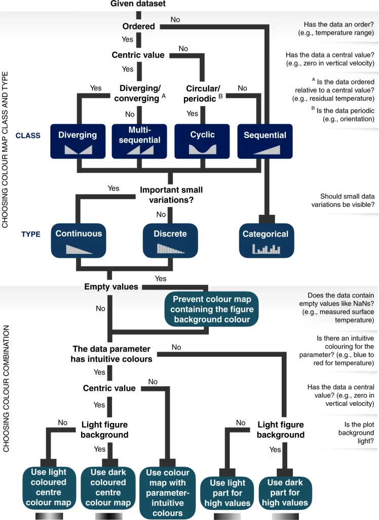
Figure 1: Guide to choosing the right scientific color chart. This guide, included in the Nature Communicationarticle, helps to select the right scientific color map for the type of data to be represented, by asking a series of key questions about the nature of the data and the visualization requirements.

The last word
These studies are essential reading for anyone wishing to communicate their results accurately and inclusively. By adopting these best practices, the scientific community can significantly improve the quality and impact of its visual communication.
Did you find this post useful? Don’t hesitate to share it.
