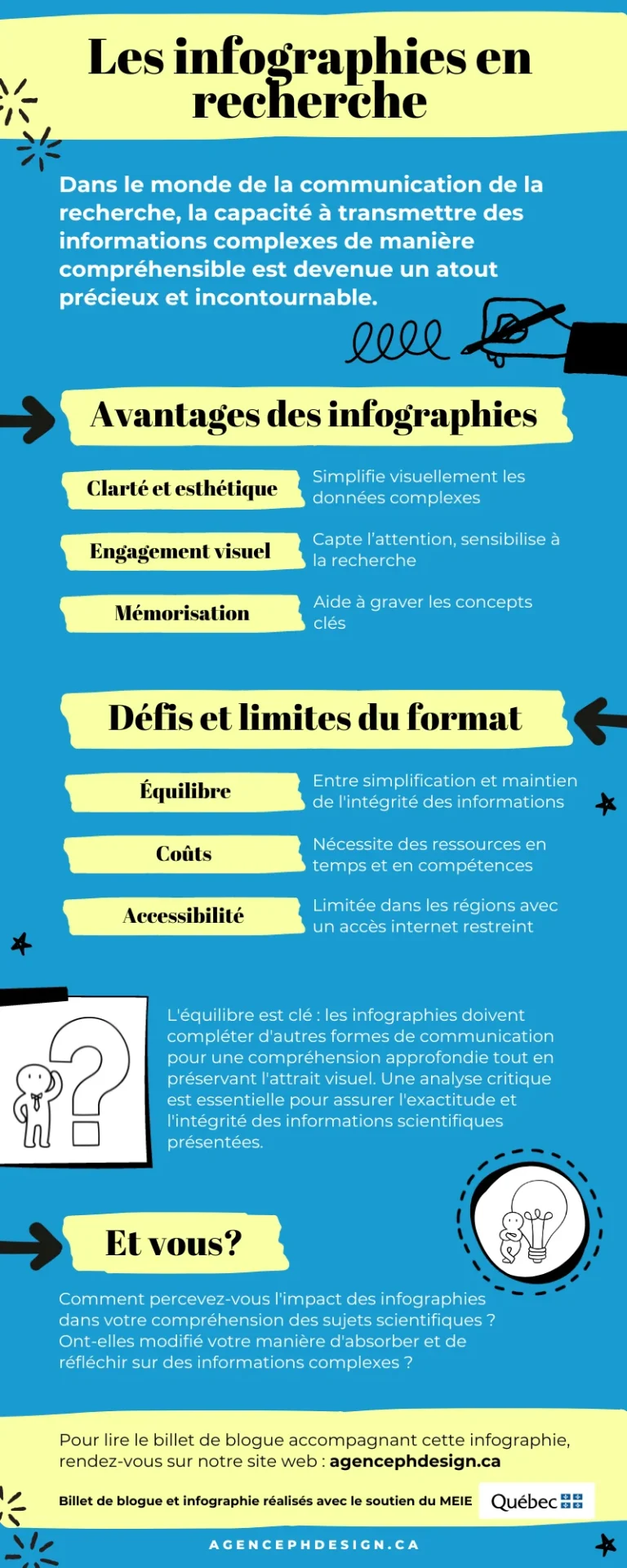
In the dynamic landscape of scientific communication, the growing importance of visual aesthetics cannot be underestimated. The ability to convey complex information in an understandable way has become a valuable and indispensable asset.
This is where infographics come in, proving an invaluable tool for researchers. Their ability to blend clarity, aesthetics and engagement offers a unique window onto the world of research, building a bridge between the research community and a diverse audience, from the student body to healthcare personnel.
Let’s think about it for a moment: who among us has never abandoned a ten-page scientific article in favor of a more concise, accessible source? This trend is not insignificant. The scientific world itself has adopted scientific posters as a means of presenting projects. Why is this? Because, let’s face it, they communicate the essentials far more effectively.
But does this efficiency come without a quid pro quo?
The benefits of infographics in research
Simplicity as the key to understanding
Infographics have the power to transform often complex and dense research data into attractive, easy-to-understand visuals. This visual simplification helps overcome the barriers associated with technical language and reduces the mental load, making scientific information accessible to a wider audience. By breaking down concepts, figures and processes into graphic elements, they make key information easier to understand and remember (1).
A driving force for commitment and sharing in scientific dissemination
The visual and often interactive aspect of infographics stimulates engagement. They capture attention, encouraging readers to explore the content presented in greater depth. What’s more, their format is ideal for sharing on social networks and other online platforms, increasing the reach and impact of research. Because of their visual appeal, infographics encourage the dissemination and discussion of scientific findings, promoting greater public awareness and appreciation of research.
Etched in memory
Infographics, by combining visual elements (graphics, icons, illustrations, etc.) with data, facilitate the retention of information by the audience. The visual nature of infographics helps engrave concepts in the memory, which is particularly useful for educational presentations or public discussions where memorization of key data is essential (2).
Despite their undeniable effectiveness in presenting data, infographics do raise pertinent questions about the integrity and depth of the information they convey. Like all medals, they have their downside.
The limits and challenges of infographics in research
The limits of simplification
By transforming complex data into visual representations, infographics carry the risk of oversimplification. This process can sometimes lead to the omission of critical nuances and details, essential for a complete understanding of the subject. It is crucial to strike a balance between the simplification required for visual clarity and maintaining the integrity of scientific information. The creation of infographics should therefore be approached with caution, taking care not to sacrifice accuracy for aesthetics (3).
A necessary but unquantifiable cost
Creating high-quality infographics requires time, graphic design skills and often financial resources. For research teams with limited budgets, this can represent a major challenge. Designing an infographic involves not only the popularization of data, but also its artistic layout, which respects the principles of design. These costs need to be taken into account when planning the communication of research results.
Accessibility issues
Infographics are strongly linked to digital platforms, which raises questions of accessibility. Their effectiveness depends on the availability and use of these platforms by the target audience. In regions with limited Internet access, or for audiences less familiar with digital technology, infographics may not reach their full potential. This dependence on digital also implies a certain precariousness, as formats and platforms evolve rapidly, potentially making infographics obsolete or less accessible over time.
The challenge of balance
To maximize the effectiveness of infographics while minimizing their drawbacks, a balance needs to be struck. One approach is to use them alongside other, more detailed communication formats, such as full research reports or feature articles. In this way, infographics serve as captivating entry points, attracting interest and facilitating initial understanding, while more in-depth formats provide the necessary detail and nuance. In addition, it’s crucial to keep a critical eye on the creative process, ensuring that they accurately reflect the data without distorting it. Finally, it’s important to consider the diversity of audiences and adapt the mode of communication accordingly, using infographics strategically to reach the groups most likely to be receptive to them.
Examples of infographics produced by our agency
What about you?
What about you? How do you perceive the impact of infographics on your understanding of scientific subjects? Have they changed the way you absorb and think about complex information?
The agency's infographic
Our agency has taken the opportunity to summarize the article you are reading in the form of an infographic. To see the infographic in PDF.

Your opinion counts
Did you find this article relevant? Share your thoughts and help us spread this article on social networks.
The writing of this article was made possible thanks to salary support from the NovaScience program funded by the Ministère de l’Économie, de l’Innovation et de l’Énergie du Québec. Le programme NovaScience est une initiative du ministère qui vise à favoriser le développement économique de toutes les régions du Québec en contribuant à l’émergence de nouvelles générations d’innovateurs. Un immense merci au ministère pour son soutien continu envers les jeunes entreprises comme la nôtre!

